
Quick note: unlike the MLB where Majestic makes every teams uniforms, NPB teams uniforms are made by a variety of manufacturers leading to more variation between the teams.
1. Hiroshima Carp
| Home |
| Road |
Not all that original, but these are just so clean, especially the home uni's.
2. Seibu Lions
 |
| Home |
 |
| Road |
Another clean look, nice lettering on the chest. Home uni is a little boring, but the road set is great
3. Chunichi Dragons

I've probably discussed these enough
4. Rakuten Golden Eagles
 |
| Home |
 |
| Road |
5. Orix Buffaloes
 |
| Home, Road & Alternate |
Really like all of these, my only complaint is that when you see the road uniform live the spacing of the letters and numbers is a little off and the gold and grey don't mesh all that well. Would have to say the alternate is a favorite.
6. Yakult Swallows
 |
| Home |
 |
| Road |
The Swallows uni's are pretty flashy, but I still like them. If they got rid of the colored triangles on the base of the sleeves and pants they would be even better.
7. Chiba Lotte Marines
 |
| Road, Alternate and Home |
These get bonus points for being such an upgrade over the horrific shark-tooth design that preceded them. This photo is from a couple years ago when they first came out. I'm not sure if they still wear that alternate.
8. Yomiuri Giants
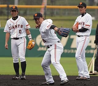 |
| Home |
 |
| Road |
It's some subtle things that drop the Giants down the list, mainly the cut-off Adidas stripage on the pants and the differing shades of grey on the road uniform's fabric (that makes vertical stripes). As much as I don't like the Giants they do have a classic color scheme and cool caps.
9. Fukuoka Softbank Hawks
 |
| Home |
 |
| Road |
These aren't bad, but I don't like the double stacked lettering on the home uni and they need to lose the yellow bills and go to an all-black cap. The double stripes on the sleeves have grown on me, they're different.
10. Yokohama DeNA Bay Stars

People seem to like these, but while I appreciate that DeNA is a gaming company and the uni design is video game-esqe they just look a little too amateurish. I don't like the new lettering or home cap logo as much as the old logo and script. I also don't like the black underarms on home uni's or how the color scheme seems to differ between the home and road sets. I do like the star hats and the idea of the monochrome dark road set.
11. Hanshin Tigers
 |
| Home and Road |
I really like their batting helmets, but I don't really have anything else positive to say about the Tigers' new uniforms. Adding extra stripage to to pinstriped uniforms just never works out.
12. Hokkaido Nippon Ham Fighters
 |
| Home |
 |
| Road |
I've never been a fan of the Fighters' unsymmetrical uniforms, I do like the use of more blue in their newer home uniforms though, it's a cool shade. Never liked their hats or home uni lettering either. The newer (2011) road uni is a slight improvement over it's predecessor, but still has double stacked lettering and it's gold. There are just way too many things that aren't working for me.
No comments:
Post a Comment